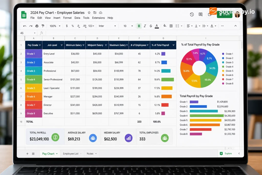
Building a pay chart in Google Sheets is one of the most practical spreadsheet skills for freelancers, small business owners, and HR staff who need to track wages, hours, and payroll trends without buying dedicated software. Whether you’re calculating hourly pay for a small team or visualizing salary bands across job grades, Sheets gives you the formulas and charting tools to do it in under 30 minutes. This guide walks through the exact steps, formulas, and formatting choices that make a pay chart genuinely useful instead of just decorative.
Setting Up Your Pay Chart Data Table
Before you touch the chart tool, you need clean, well-structured data. Google Sheets charts are only as good as the underlying table, and a messy layout is the number one reason pay charts break or display wrong.
Start with a new sheet and set up these baseline columns in row 1:
- Employee Name or Pay Period (whichever you’re tracking by)
- Hourly Rate or Base Salary
- Hours Worked (regular and overtime as separate columns if relevant)
- Gross Pay (a calculated column)
- Deductions (taxes, benefits, if you’re building a full pay stub view)
- Net Pay
If you’re tracking pay across a team rather than a single person’s history, put each employee in their own row rather than columns. Charts in Sheets read data far more predictably when categories run vertically. Getting the header names right matters more than people expect — if you’ve inherited a messy sheet with vague headers like “Col1” or “Amt,” it’s worth fixing that first, and our guide on how to rename columns in Google Sheets covers the fastest ways to do it, including batch renaming with Find & Replace.
A pay chart with unclear headers is a liability, not a convenience — anyone auditing payroll later needs to know exactly what each column represents without guessing.
Calculating Gross and Net Pay with Formulas
Once your columns exist, the real work is formulas that turn raw hours and rates into pay figures automatically. This is where Sheets outperforms a static table in Google Docs or a printed form.
For a basic hourly gross pay calculation, use:
=B2*C2
Where B2 is the hourly rate and C2 is hours worked. But real payroll rarely stops at straight multiplication — overtime, taxes, and benefit deductions all need conditional logic.
Handling Overtime Automatically
Most US employers must pay 1.5x the regular rate for hours worked beyond 40 per week under federal FLSA rules. Build that directly into your formula instead of calculating it by hand:
=IF(C2>40, (40B2)+((C2-40)B21.5), C2B2)
This formula checks if hours worked (C2) exceed 40. If they do, it pays the first 40 at the standard rate and everything above that at 1.5x. If not, it just multiplies rate by hours.
Calculating Net Pay After Deductions
For a simplified net pay column, subtract a deductions column from gross pay:
=D2-E2
Where D2 is gross pay and E2 is total deductions (tax withholding, insurance, retirement contributions). For a more realistic model, many people build a small tax-bracket lookup table and use VLOOKUP or XLOOKUP to pull the correct percentage based on income tier, rather than hardcoding a flat tax rate that doesn’t reflect graduated brackets.
Turning Your Pay Data Into a Visual Chart
This is the step most people actually mean when they say “pay chart” — a visual graph showing pay trends, comparisons, or distributions, not just a spreadsheet table.
Follow these steps to build the chart itself:
- Select the data range you want charted, including headers (e.g., Employee Name and Gross Pay columns).
- Go to Insert in the top menu, then click Chart.
- Google Sheets will auto-suggest a chart type in the Chart Editor sidebar — but don’t trust the default blindly.
- Click the Setup tab and change the chart type manually if needed.
- Use the Customize tab to edit axis titles, colors, legend position, and data labels.
- Click outside the editor to place the chart on your sheet, then drag it to resize or reposition.
Which Chart Type Actually Works for Pay Data
| Chart Type | Best For | Avoid When |
|---|---|---|
| Column chart | Comparing pay across employees or departments | You have more than 15-20 categories (gets cluttered) |
| Line chart | Tracking one person’s pay over multiple periods | Comparing unrelated employees side by side |
| Stacked bar chart | Showing gross pay broken into regular + overtime + bonus | Data isn’t naturally additive |
| Pie chart | Showing payroll budget allocation by department | Tracking pay over time (pie charts can’t show trends) |
For most small business owners building a monthly payroll overview, a stacked column chart tends to be the most informative single view — it shows total pay per employee while still breaking out how much came from overtime versus base hours.
Formatting, Currency, and Conditional Highlighting
A pay chart that isn’t formatted for currency looks unprofessional and invites errors, especially if someone reads “4500” and assumes it’s not dollars.
Select your pay columns, then:
- Go to Format > Number > Currency to auto-apply the $ symbol and two decimal places.
- Use Format > Conditional formatting to flag anomalies — for example, highlight any row in red where hours worked exceed 60, which often signals a data entry error or a compliance risk.
- Freeze the header row via View > Freeze > 1 row so column labels stay visible as you scroll through a long payroll list.
- Apply alternating row colors (Format > Alternating colors) to make long employee lists easier to scan.
Conditional formatting is particularly valuable in payroll because it turns your sheet into a lightweight audit tool. If a formula accidentally references the wrong cell and produces a gross pay figure of $45,000 for a part-time employee, a red highlight rule catches it before the chart visualizes bad data.
Collecting Pay and Hours Data at the Source
If you’re managing a team, manually typing hours into Sheets every pay period is where most errors creep in. A cleaner workflow has employees submit their own hours through a form that feeds directly into your pay chart’s source sheet.
Google Forms links natively to Sheets — every form submission appends as a new row automatically. This means your gross pay formulas in column D can be written once and dragged down, recalculating instantly as new timesheet submissions arrive. If you eventually need to stop collecting new entries (say, after a pay period officially closes), it’s worth knowing how to close a Google Form cleanly so late submissions don’t create discrepancies between your chart and actual paid amounts.
A Quick Data Hygiene Checklist
- Lock the header row and formula columns using Data > Protected sheets and ranges so employees entering hours can’t accidentally overwrite formulas.
- Use Data > Data validation on the hours column to reject entries above a sane threshold, like 24 hours in a single day.
- Add a timestamp column (Forms does this automatically) so you can audit when each entry was submitted.
- Keep a separate archived tab per pay period rather than overwriting the same rows monthly.
Payroll Data Security Considerations
Pay charts contain sensitive personal financial information, and that makes them a target. Payroll and HR data has increasingly become a vector for social engineering attacks, where scammers impersonate IT staff or executives to trick employees into revealing spreadsheet access or login credentials.
There’s real precedent for this concern in the financial sector specifically — reporting on hackers calling financial firm employees to gain access and extort victims highlights how attackers are shifting toward voice-based social engineering rather than just phishing emails, which means payroll spreadsheets shared too loosely across an organization are a genuine liability.
A few practical safeguards:
- Never share a pay chart sheet with “Anyone with the link” — always restrict to specific email addresses.
- Use View Only access for anyone who doesn’t need to edit figures.
- Turn on two-factor authentication for the Google account hosting sensitive payroll sheets.
- Periodically check Tools > Sheet activity dashboard to see who has viewed or edited the file.
Advanced Touches: Pivot Tables and Payroll Summaries
Once your base pay chart is built, a Pivot Table lets you summarize payroll data without altering your source sheet at all.
To build one:
- Select your full data range.
- Go to Insert > Pivot table, and choose to place it on a new sheet.
- Drag “Department” or “Employee” into Rows.
- Drag “Gross Pay” into Values, and set the summarization to SUM.
- Optionally drag “Pay Period” into Columns to get a month-by-month payroll breakdown.
This gives you a live summary that automatically updates as new rows get added to your source data — no manual recalculating required. It’s especially useful for small business owners comparing quarterly payroll costs against revenue, since the pivot output can itself be charted using the same Insert > Chart process described earlier.
For context on how mainstream digital payments are evolving alongside spreadsheet-based tracking, it’s worth noting that even consumer tools are adding more structured financial oversight features — for instance Google Wallet’s new parental balance controls reflect a broader shift toward transparent, auditable money tracking that mirrors what a well-built pay chart does for a business’s payroll.
Conclusion
A pay chart in Google Sheets isn’t just a static grid of numbers — it’s a living calculation engine that turns raw hours and rates into gross pay, net pay, and visual trend lines with almost no manual math. The real skill isn’t inserting a chart; it’s structuring the underlying data cleanly, automating overtime and deduction logic with formulas, and locking down access so sensitive payroll figures don’t leak. Get those three things right, and the chart itself takes less than five minutes to generate. Once built, a well-designed pay chart scales effortlessly from tracking one freelancer’s monthly invoices to summarizing an entire department’s quarterly payroll costs, all inside a tool most people already have open every day.
FAQ
Yes, though it’s more limited — you can manually type gross pay and net pay figures into cells and still generate a chart from that static data using Insert > Chart. The tradeoff is that any change to hours or rates won’t automatically recalculate, so you’ll need to update figures by hand each pay period, which increases the risk of errors compared to using formulas like =B2*C2.
A column chart is generally best for comparing discrete categories like individual employees or job titles side by side. If you also want to show how each person’s pay breaks down between regular hours, overtime, and bonuses, a stacked column chart adds that extra layer of detail without needing a second chart.
The most reliable method is connecting a Google Form to your Sheet so employees submit hours directly, which append as new rows that your existing formulas automatically calculate. Combine that with a pivot table summarizing totals by pay period, and your chart’s source data refreshes without any manual copy-pasting.