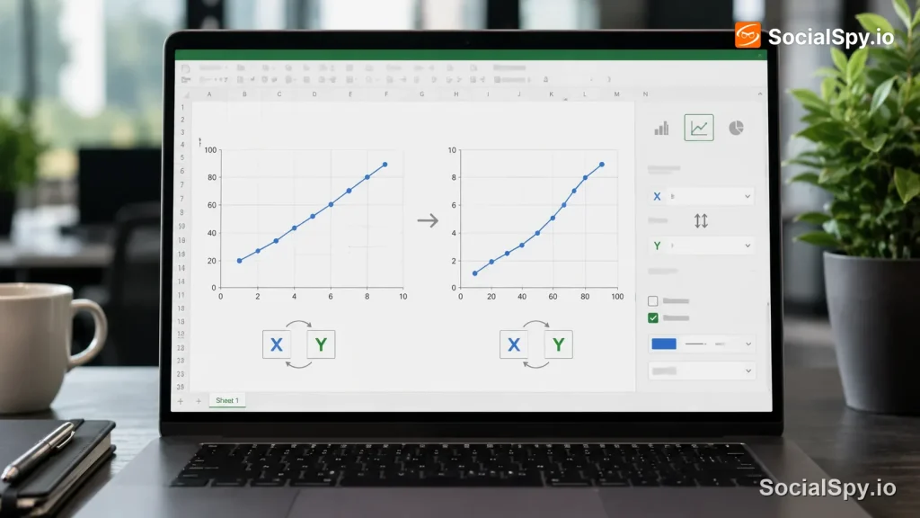
Excel charts don’t always plot data the way you expect, and one of the most common frustrations is finding your categories and values flipped from what you intended. The good news is that swapping the X and Y axis in Excel takes just a couple of clicks once you know where Microsoft buried the option. This guide walks through every method, from the built-in Switch Row/Column button to manual workarounds for stubborn chart types.
Why Excel Plots Axes the Way It Does
Excel makes an automatic guess about which of your data ranges should become the horizontal (category) axis and which should become the series plotted as lines, bars, or points. That guess is based on the shape of your selected range, not on any deep understanding of what your numbers mean.
Specifically, Excel looks at whether you have more rows or more columns in your selection.
- If you have more rows than columns, Excel typically plots each column as a separate series and uses row labels for the category axis.
- If you have more columns than rows, it usually reverses that logic and treats each row as a series.
- This heuristic works fine for simple two-column tables but breaks down fast with wide datasets, pivoted tables, or data exported from another system.
This is exactly why financial models, survey results, and time-series data pulled from tools like Google Analytics or a CRM often render backwards on the first try. Excel isn’t wrong, technically – it’s just applying a generic rule to data it can’t semantically interpret. Understanding this default behavior helps explain why the swap option exists as a single-click toggle rather than something you’d need to rebuild manually.
The Fastest Method: Switch Row/Column Button
For the vast majority of charts – column, bar, line, and most combo charts – Microsoft built a dedicated button specifically for this problem. It lives inside the Chart Design contextual tab that only appears when a chart is selected.
Here’s the exact sequence:
- Click anywhere on the chart to select it, which activates the Chart Design and Format tabs.
- Go to the Chart Design tab in the ribbon.
- In the Data group, click Switch Row/Column.
- Excel instantly redraws the chart with the axes swapped.
- If it looks worse, click the button again or press Ctrl+Z to revert.
On Mac versions of Excel, the same button appears under the Chart Design tab, though older builds sometimes label it slightly differently or nest it inside the Select Data dialog.
If you don’t see the Switch Row/Column button at all, it usually means your chart type doesn’t support row/column swapping natively – pie charts and certain radar charts fall into this category, which is discussed further below.
Using the Select Data Dialog for More Control
Sometimes the one-click button doesn’t give you the exact result you want, especially with charts that have multiple series or custom labels. The Select Data Source dialog gives you granular control over what gets plotted where.
To open it:
- Right-click on the chart area (not on a specific data point) and choose Select Data.
- In the dialog box, you’ll see two panels: Legend Entries (Series) on the left and Horizontal (Category) Axis Labels on the right.
- Click the Switch Row/Column button inside this dialog – it performs the same function as the ribbon button but shows you a live preview.
- To manually reassign a specific series, select it under Legend Entries and click Edit to redefine its range.
- Click OK to apply.
This method is particularly useful when your dataset has headers in unusual positions, merged cells, or when you’ve built a chart from a filtered table. Editing individual series ranges through this dialog also solves a related problem: charts that plot the wrong column as the category axis because Excel picked up a numeric column instead of a text label column.
When Manual Series Editing Beats the Auto-Switch
There are situations where the automatic swap makes things worse, not better – typically when your data has more than two dimensions crammed into one range.
- Datasets with three or more variables (like region, month, and revenue) often need manual series selection rather than a blanket switch.
- Data copied from a pivot table frequently has subtotal rows that confuse the auto-detection.
- Charts built from data validated with conditions similar to those covered in how to do greater than or equal to in Excel sometimes carry hidden helper columns that throw off which range Excel treats as the series.
In these cases, manually defining each series through Select Data – rather than relying on the single toggle – gives a cleaner, more predictable result.
Scatter Charts: A Special Case
Scatter (XY) charts behave completely differently from bar or line charts, and this trips up more Excel users than any other axis issue. In a scatter chart, there’s no automatic row/column detection – the X and Y values are explicitly tied to specific columns you chose when creating the chart.
That means the Switch Row/Column button often does nothing useful on a scatter plot, or it behaves unpredictably. To truly flip the X and Y axis on a scatter chart, you need to swap which column feeds which axis at the series level.
Here’s how:
- Right-click the chart and select Select Data.
- Under Legend Entries (Series), click the series name, then click Edit.
- You’ll see two fields: Series X values and Series Y values, each pointing to a specific cell range.
- Swap the ranges – put what was in the X values field into the Y values field, and vice versa.
- Click OK, then OK again to close the dialog.
| Chart Type | Switch Row/Column Works? | Manual Series Edit Needed? |
|---|---|---|
| Column/Bar | Yes | Rarely |
| Line | Yes | Sometimes |
| Scatter (XY) | No/Unreliable | Almost always |
| Pie | No (single series only) | N/A |
| Combo | Partially | Often |
This distinction matters a lot for anyone building scientific charts, regression plots, or correlation graphs, since scatter charts are the default choice for that kind of analysis. Getting the X and Y values backwards on a scatter chart doesn’t just look wrong – it can misrepresent which variable is independent and which is dependent, which matters if you’re presenting statistical findings.
Flipping Axis Order Without Changing the Data Series
There’s a second, entirely different meaning of “switching axes” that people often search for: reversing the direction or order of values along an existing axis, rather than swapping which dataset feeds which axis. If your bar chart’s categories are listed bottom-to-top when you want top-to-bottom, this is the fix you actually need.
To reverse an axis’s order:
- Right-click directly on the axis labels you want to reverse.
- Choose Format Axis to open the task pane.
- Under Axis Options, check the box for Values in reverse order (or Categories in reverse order, depending on axis type).
- Note that this often also flips which side the opposite axis crosses – you may need to adjust Horizontal axis crosses to “At maximum category” to keep labels readable.
- Close the pane once the layout looks correct.
This is a completely separate feature from Switch Row/Column, and confusing the two is one of the most common support questions Excel users run into. Switch Row/Column changes what data appears on each axis; reversing order changes the sequence in which existing values are displayed.
Formatting the Result So It Actually Reads Well
Swapping axes almost always requires a quick cleanup pass afterward, because label lengths, column widths, and spacing that worked in the original orientation rarely translate cleanly to the new one.
- Long category labels that fit fine on a vertical axis often get truncated or overlap when moved to a horizontal axis – widening the source columns first, similar to techniques in how to modify column width in Excel, can prevent this before you even build the chart.
- If your source table has many hidden or collapsed columns feeding the chart, expanding them first (see how to expand all columns in Excel) ensures the swap picks up the full range rather than a partial one.
- Axis titles don’t auto-update when you swap – you’ll need to manually retitle “Category Axis Title” and “Value Axis Title” through the Chart Elements menu (the green plus icon).
- Number formatting, like currency symbols or percentage signs, sometimes resets to General format after a switch, so double-check it against your original.
- If the chart is shared with others and shouldn’t be re-edited, consider locking down the underlying sheet using the approach in how to make an Excel spreadsheet read only once the final layout is confirmed.
Industry Excel trainers frequently note that axis-swap complaints are actually formatting complaints in disguise – the data is correct, but labels overlap or truncate, making the chart look “broken” when it’s really just unformatted.
Common Errors and How to Fix Them
Even experienced spreadsheet users hit predictable snags when reworking chart axes. Knowing the fix in advance saves a lot of trial-and-error clicking.
- Switch Row/Column is grayed out. This usually means the chart was created from a non-contiguous or table-based range where Excel can’t cleanly parse rows versus columns – try recreating the chart from a simple, contiguous cell range instead.
- Dates on the axis turn into serial numbers after switching. This happens when a date column that was previously treated as text labels gets reinterpreted as a data series – reformat the axis under Format Axis > Number.
- Legend entries become nonsensical after swapping. Excel is pulling header text from the wrong row or column – fix this manually inside Select Data by editing each series name field individually.
- Chart title doesn’t reflect the new orientation. Titles linked to a cell reference sometimes stay static; if it’s a dynamic linked title, re-point the formula to the correct cell.
- Formula-driven charts stop updating after a swap. If your chart source relies on formulas that broke or are returning errors, it’s worth checking against the troubleshooting steps in Excel formula not calculating before assuming the chart itself is at fault.
Conclusion
Switching the X and Y axis in Excel is rarely a single universal action – it depends entirely on what you’re actually trying to fix. For most bar, column, and line charts, the Switch Row/Column button under Chart Design solves the problem in one click. For scatter plots, you need to manually swap the X and Y value ranges inside Select Data, since there’s no row/column detection to toggle. And if your real goal is reversing the order of values rather than swapping datasets, the fix lives in Format Axis, not in the Data group at all. Knowing which of these three scenarios you’re in – before you start clicking around the ribbon – is the difference between a five-second fix and twenty minutes of frustrated troubleshooting.
FAQ
Scatter (XY) charts don’t use the row/column auto-detection system that bar and line charts rely on. Instead, each series has explicit X-value and Y-value ranges defined in Select Data, so you need to manually swap those two ranges under the series’ Edit dialog to flip the axes.
No, switching axes only changes how the existing data is visualized in the chart – it never modifies, moves, or overwrites the cells in your worksheet. You can toggle it back and forth as many times as needed without any risk to your source data.
Right-click the axis, choose Format Axis, and check the box for “Values in reverse order” or “Categories in reverse order” depending on the axis type. This only changes the display sequence of existing labels or values, not which dataset is plotted where, so it’s a completely different fix from Switch Row/Column.